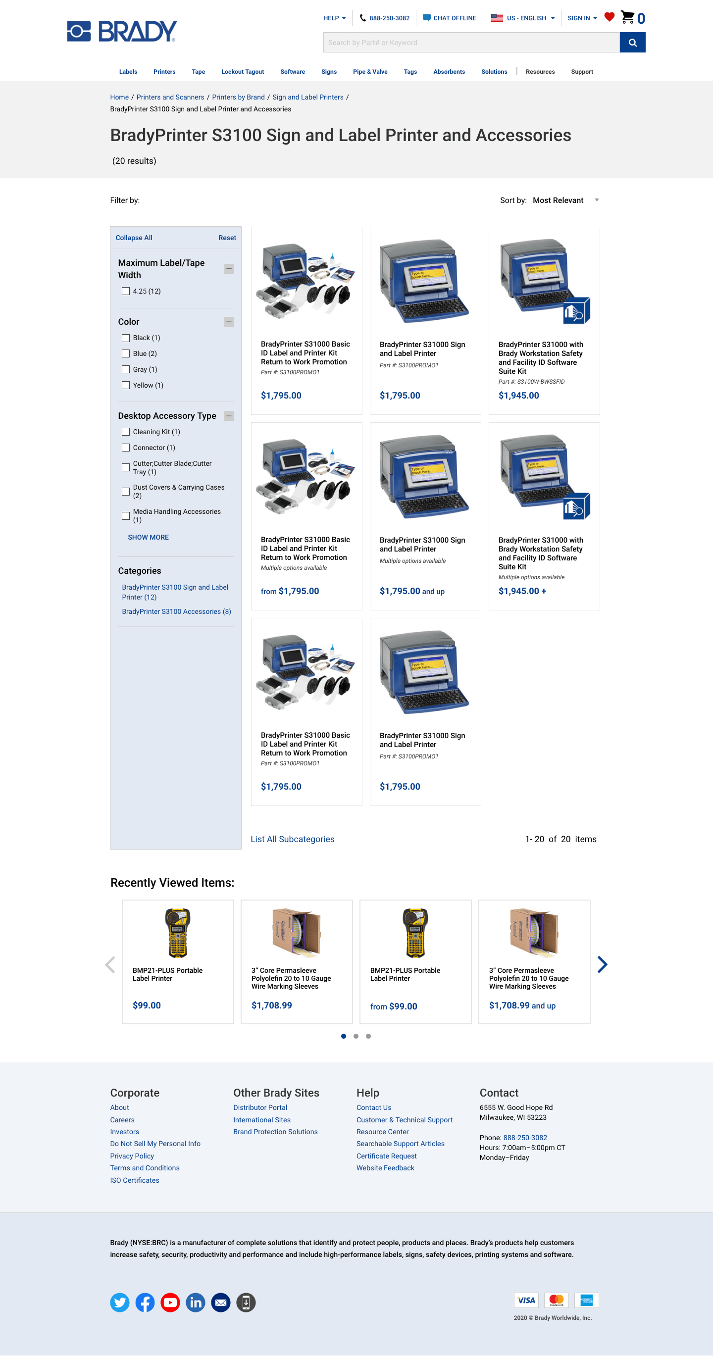
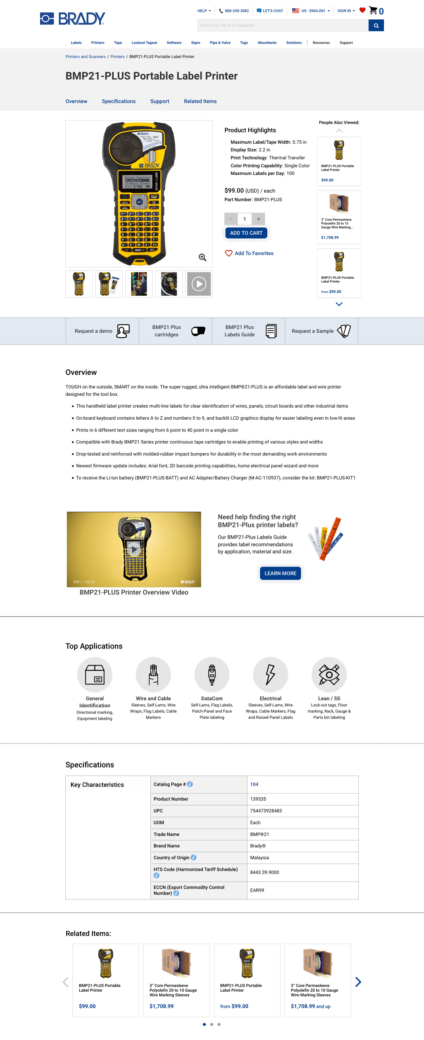
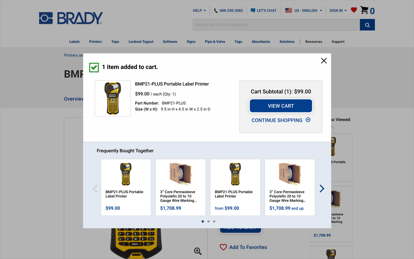
Clarifying the Hierarchy
Our previous design used centered text and buttons below each product image, which gave the page a very ragged and cluttered look that was confusing for users scanning for items and prices. It also impacted accessibility as centered text is harder to read, and repeated links are confusing (especially for those with an impairment of any kind using assistive technology). The new design prioritized simplicity while keeping information grouped & left aligned to solve these issues.